Cutting and making
Matching labels look simple until a first print reveals a shifted grid, a narrow edge or text too close to a cut line. A layout can be mathematically neat on screen and still fail on real label stock because paper size, printer margins, scaling and material all introduce limits. A reliable sheet begins with the physical page and ends with a small, honest print test.
This approach is useful for product labels, small cards, address stickers, repeatable QR codes, price tags and simple packaging inserts. The underlying method stays the same: define the usable page area, build a repeatable grid, protect important content inside each label and compare a test print with the material you intend to use.
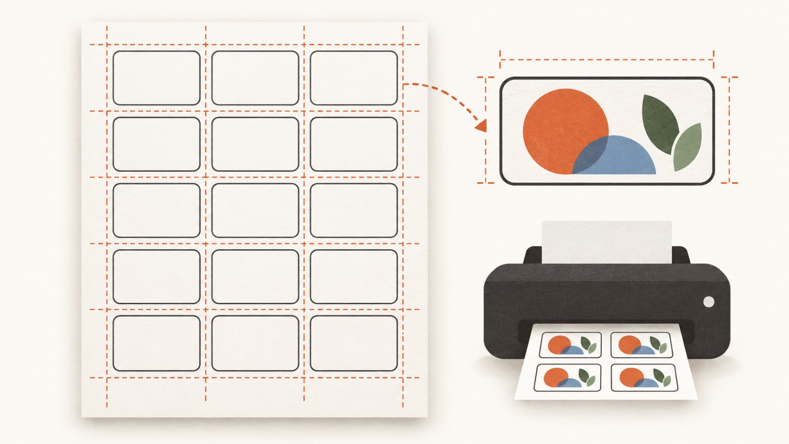
A dependable label sheet is built from the real page, outer margins, even gaps and an inner safe area.
Start with the real sheet, not an ideal page
Before you add text or decoration, identify the actual paper or label stock. Choose its page format and orientation, then measure what matters: the width and height of one label, the outer margins and the gaps between labels. If you are using a pre-cut label sheet, measure more than one cell. Manufacturing tolerances and small offsets can matter across the page.
Do not copy a template simply because its name resembles your label stock. Two sheets described in similar ways can have different top margins, column gaps or label heights. If the sheet will be cut manually, account for the space your cutting method needs rather than designing labels edge to edge by default.
Decide what each label must contain. A name, short description, price, code, date, colour name or QR code all need room. The more elements you add, the more important an inner safe area becomes: space between important content and the label edge.
Understand the three spaces in a label grid
The page usually contains three different kinds of empty space. They are easy to confuse, and each solves a different problem.
The outer margin sits between the page edge and the first row or column of labels. It protects the layout from non-printable printer edges, feed variation and imperfect stock alignment. The gap sits between neighbouring labels. It separates the cells and can make cutting or peeling easier. The inner safe area belongs inside each label. It keeps text, QR codes and small graphics away from an edge that may shift or be trimmed.
If a calculation just barely fits across the page, it is usually safer to reduce the label count or increase the margin than to rely on perfect feeding. A small amount of calm space is often less costly than an entire unusable sheet.
Build the grid step by step
1. Set the page format and orientation
Use the page that will actually go into the printer: a standard sheet format, its landscape version or a custom size. Page rotation and content rotation are not always the same thing, so check the dimensions after changing orientation.
If the sheet is pre-cut, use the stock as the source of truth. If you are printing and cutting your own labels, start with the final physical sheet size and include the space needed for trimming.
2. Define the usable area and outer margins
Printers may leave unprintable edges, and the paper may shift slightly during feeding. Outer margins make those limitations visible in the design rather than discovering them after printing. A damaged edge, a pre-punched hole or a folded area also belongs outside the usable area.
Do not assume the four margins must be identical. A real sheet or printer may need different top, bottom and side allowances. Measure the material and confirm the result with a plain-paper test.
3. Set label size and gaps
Once the usable area is known, place the label width and height inside it with clear horizontal and vertical gaps. Check that a full row and a full column fit. Partial labels at the edge do not increase useful output.
Keep gaps consistent unless the physical stock requires otherwise. Uneven spacing is difficult to notice while editing one cell but becomes obvious across a finished sheet.
4. Protect content inside every label
The safe area is not an aesthetic border. It protects content from small printing or cutting shifts. Let background colour or a decorative pattern run to the edge only when that is intentional; keep the important text, thin rules, QR code and key graphic comfortably inside.
Small labels often benefit from simpler content. If a code, price, long product name and dense illustration all compete for a tiny space, moving an element closer to the edge is rarely the best fix. Shorten the message, enlarge the label or create a different label type.
5. Finalise one prototype before repeating it
Create a single label as a reference. Check alignment, hierarchy, contrast and safe area, then repeat that approved prototype through the grid. For variable labels, keep the placement and style fixed while only the text, number or code changes.
This reduces inconsistency and makes later revisions quicker. A clean prototype is easier to correct once than a sheet of nearly identical labels with small accidental differences.
6. Run a plain-paper test, then a material test
Print the grid on ordinary paper at the intended scale. Place it over the real label stock or compare it with a ruler and the sheet in good light. Check the first and last labels: a tiny scale difference can become much more obvious by the bottom row or final column.
Then test one sheet of the real material before a larger run. Matte paper, glossy stock, transparent labels and textured surfaces can alter colour, legibility and small details. Confirm that the print dialogue has not silently applied an automatic “fit to page” setting if the layout needs its original scale.
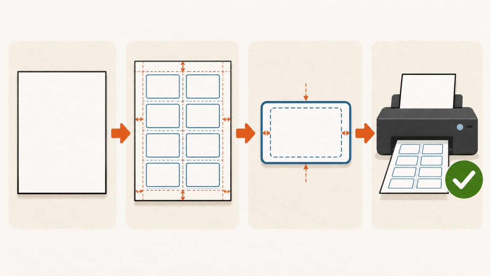
A clear workflow: define the real page, build the grid, keep content inside safe zones and test the result on paper before a full run.
QR codes and small text need extra care
A QR code must remain square, have enough contrast and keep clear space around it. Do not place it on a cut line or crowd it with decoration. Test the printed version with a phone, not just the version displayed on your monitor.
Small text has similar risks. A size that appears readable at high zoom may become faint or crowded on the material. Print a sample and view it at the normal distance a customer will use. If it is hard to read, simplify rather than merely tightening the spacing.
Common layout problems
| Problem | Likely cause | Practical check |
|---|---|---|
| The whole grid shifts toward an edge | Page size, margins or print scaling do not match the real sheet | Print on plain paper and overlay it on the label stock |
| The final column is clipped | The grid used the page size rather than the usable area | Check non-printable edges and reduce the count or increase the margin |
| Text feels crowded | There is no inner safe area | Add internal padding and review the label at real scale |
| A QR code will not scan | It is too small, too close to an edge or lacks contrast | Scan a printed sample with a phone |
| Colour differs from the screen | Stock and printer behave differently from the display | Test on the same material as the final batch |
SVG and printing: useful, but not a guarantee
An editable SVG layout can be helpful because text, shapes and repeated elements remain easy to refine in a compatible editor. It does not guarantee perfect printer alignment. Applications can handle page size, scale and SVG features differently, so open the final file in the program you will actually use for printing and check the page settings.
Before a large run, confirm the real page size, orientation, print scale and physical result. A design that looks correct in an editor still needs a test on your printer and material.
Frequently asked questions
Do all four page margins need to match?
No. A real printer or label sheet can have different limits on different sides. Measure the stock and let the physical material guide the layout.
Can labels touch each other?
Only if that matches the stock or your cutting process. A small gap is usually safer when hand cutting or when print alignment may shift.
Why does the top of the sheet align while the bottom drifts?
A small difference in label height, row gap or print scale accumulates across every row. Measure the full page with a test print, not only the first label.
Is a plain-paper test enough?
It is the best first check for alignment and scale. Also test on the real stock when material, colour, texture or adhesion matter.
Can a QR code go on a small label?
Yes, if it keeps a clear area around it, enough contrast and passes a scan test at the final printed size. Do not rely on the screen preview alone.
Will one layout work on every printer?
No. Even with the same page size, printers differ in margins, feeding and scaling behaviour. Check your actual printer and stock.
Next practical step
Measure one real sheet, build a small test row with the intended margins and gaps, and print it on plain paper. Compare it with the label stock before making a full sheet. Once it aligns, test one final label on the actual material and scan any QR code before you print the batch.
Keep learning
Choose another practical guide or return to the tools for the next step.