Laser and engraving
Dithering turns smooth photographic tones into a pattern of separate marks or dots. From a normal viewing distance, the eye reads different dot densities as light, shade, form and detail even though the engraving itself does not contain a smooth gradient. This can be a useful way to prepare a photograph, portrait or illustration for laser engraving, but it does not make every photo suitable for every material.
A good result begins with the source image, not with a random dot pattern. You need a recognisable subject, useful contrast, a sensible physical size and a real test on the material. Two similar materials can render light areas and dark dots differently, so an on-screen preview is a direction, not a promise of the finished object.
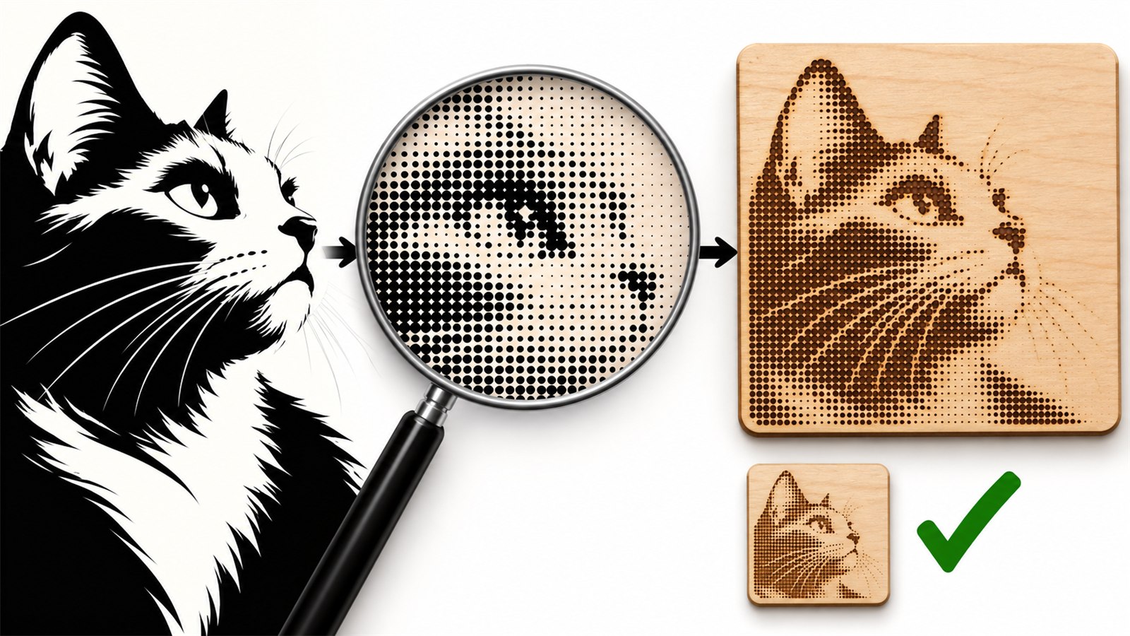
Dithering uses dot density to suggest light and shade; the key question is whether the subject remains recognisable at the real finished size.
When dithering is a good fit
This approach is often used for photographs, portraits, pets, memorial images and illustrations with several levels of light and dark. It can be less useful for a simple logo, clear lettering or a flat icon, where crisp contours and solid shapes may be more appropriate.
Dithering does not add missing information. If a face is tiny in a crowded image, a pattern of dots will not make it clearer. If the background is as dark and busy as the subject, the result may become unreadable texture. In some cases, the best preparation is a different photo or a simpler design rather than trying to preserve everything.
Choose a suitable photo
Start with an image where the main subject separates visibly from the background. For a portrait, that may mean recognisable features and no distracting objects behind the head. For an animal, it may mean a clear silhouette, eyes or distinctive outline. For an object, it may mean a shape and lighting that keep important edges visible.
Check the photo at a smaller size. If the subject is not clear without zooming, it is unlikely to become clearer after it becomes dots. Crop away excess background, accidental edges and distractions. Leave a small margin around important content, especially when the finished piece will sit inside a frame, keychain or limited engraving area.
Do not use a compressed preview as your only source. Keep the original and create a separate working copy for crop and tonal preparation. That makes it possible to return to another composition without accumulating quality loss.
Prepare tone and composition before adding dots
Dithering can describe the relationship between light and dark, but it needs a clear foundation. Before converting an image to dots, look at where the lightest and darkest areas sit. Important features should not disappear into one dense shadow or fade into an overly light background.
Do not aim for maximum contrast at any cost. Excessive processing can remove mid-tones that give a face or object its shape. The useful question is not “How dark is this image?” but “Can a viewer still understand what it shows?”
When the finished item will be small, simplify the task. Enlarge the main subject, remove background or choose an image with a clearer composition. The smaller the physical engraving, the less room it has for subtle transitions and tiny detail.
Judge dot patterns at physical scale
A dot pattern often looks rough when zoomed in. That is not always a fault; it is intended to be seen from a normal viewing distance. On a very small product, however, dots can merge. On a very large item, they can seem too open. Review the image at a size close to the finished object.
Look from normal distance first, then closer. The main subject, overall contrast and important features should read. If the result becomes only a dark mass at normal distance, return to the photo, crop, tone or scale rather than simply adding more dots.
If the item has a known shape, overlay that boundary on the working image. A round frame, narrow keychain, plaque edge or hanging hole can take away a key part of the composition. Keep a face, eyes, message or other critical feature away from the boundary.
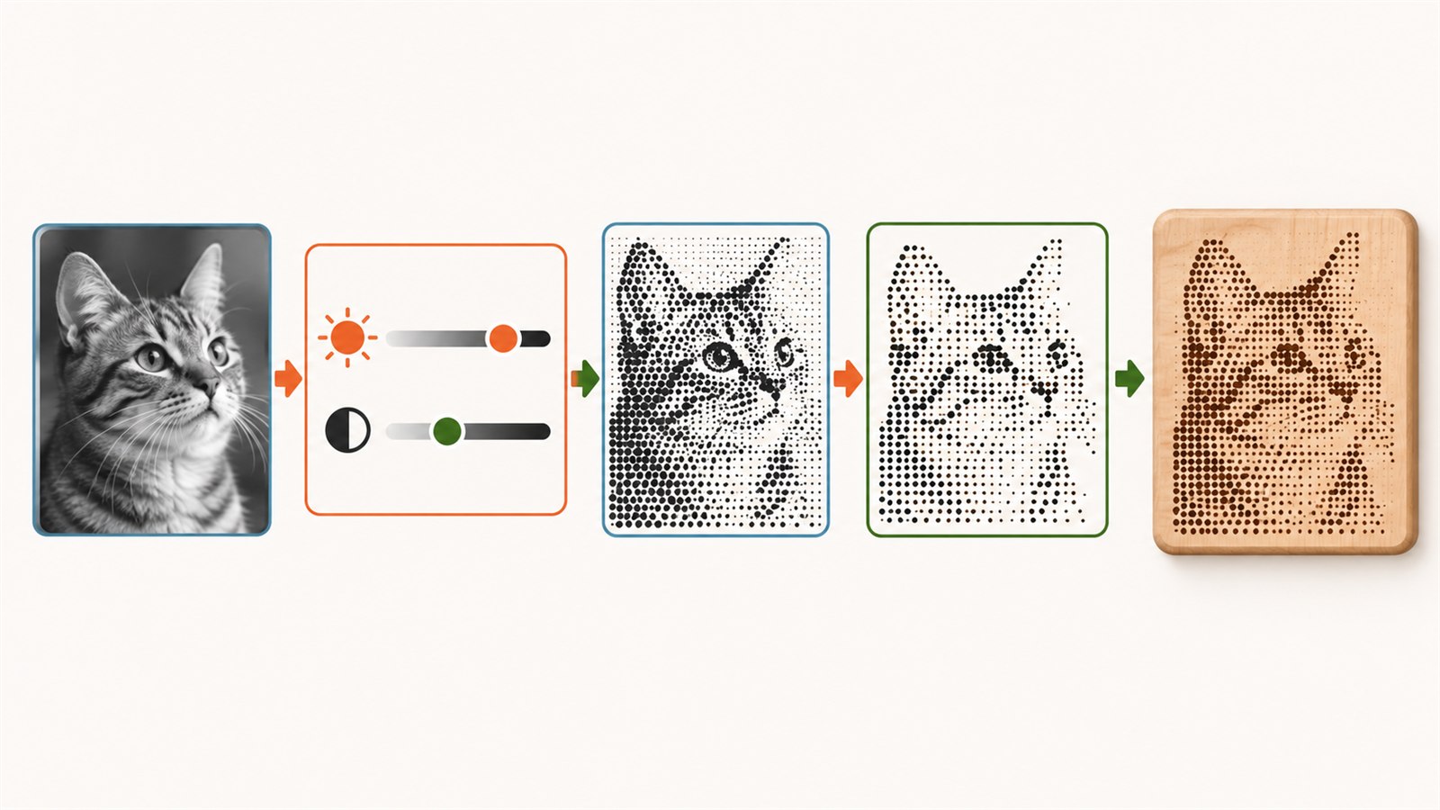
A practical sequence: choose a clear photo, protect the subject with the crop, judge dots at real size and test them on the actual material.
Make a small material test
Dot behaviour depends on the material, surface, colour, image preparation and specific process. A test engraving on an offcut of the same material shows whether light areas remain open, shadows stay separate and important features remain visible.
You do not need to engrave the entire photograph first. Prepare a compact section containing eyes, fine detail, shadow and light background. If that section does not read well, the full version rarely improves by itself.
When the test needs improvement, change one factor at a time: the source crop, physical size, tonal preparation or dither treatment. Save a short note about the material and the accepted version. That will be more useful than trying to remember a successful setting later.
Common problems and practical checks
| Problem | Likely cause | Practical check |
|---|---|---|
| A face or object is not recognisable | The subject is too small or the background is too busy | Crop closer and view a thumbnail |
| Dark areas merge into a block | The source lacks useful mid-tones or the result is too dense | Test a section with shadows and important features |
| Light areas vanish | The material and preparation do not show enough difference | Test on the real material |
| Dots look too coarse | The product scale does not suit the image detail | Review the composition at the physical size |
| A key detail sits at the edge | The final product shape was not considered | Overlay the frame, keychain or plaque boundary before processing |
What dithering cannot promise
Dithering does not give identical results on every material or machine, restore details from a poor photo or replace testing. It is not the only way to prepare an image for engraving either. For simple graphic work, clear vector contours or a more direct tonal image may be a better choice.
Do not use this article as a source of universal machine settings. Check the requirements of your own equipment and material, then test a small sample. The goal is a suitable visual result, not a promise that every photograph will engrave the same way.
Frequently asked questions
Is every photo suitable for dithering?
No. The best starting points have a clear subject, useful contrast and a reasonably simple background. Dots do not fix poor composition.
Why does the dot pattern look rough at high zoom?
It is designed to be read from normal distance. Judge it at the physical scale of the finished item, not only at maximum zoom on a screen.
Does the background need to be transparent?
Not necessarily. Simplifying the background or cropping the image may be enough. The right choice depends on the subject, material and final shape.
Is dithering a good method for small text?
Usually not. Text generally needs clear paths and enough physical size. Dot patterns are more useful for tonal artwork.
Why does a test on another offcut look different?
Material, coating, colour and visible side can all affect the appearance of dots. Use a sample as close as possible to the final sheet for important work.
Can one prepared file be used on several materials?
It can be a starting point, but test the result on each material. The same dot pattern can look noticeably different across surfaces.
Next practical step
Choose one photo with a clear subject. Make a working copy, crop away unnecessary background, view the dot treatment at the finished size and test a small section on an offcut of the actual material. If the subject is not recognisable at normal distance, return to composition before engraving the full image.
Keep learning
Choose another practical guide or return to the tools for the next step.